Background
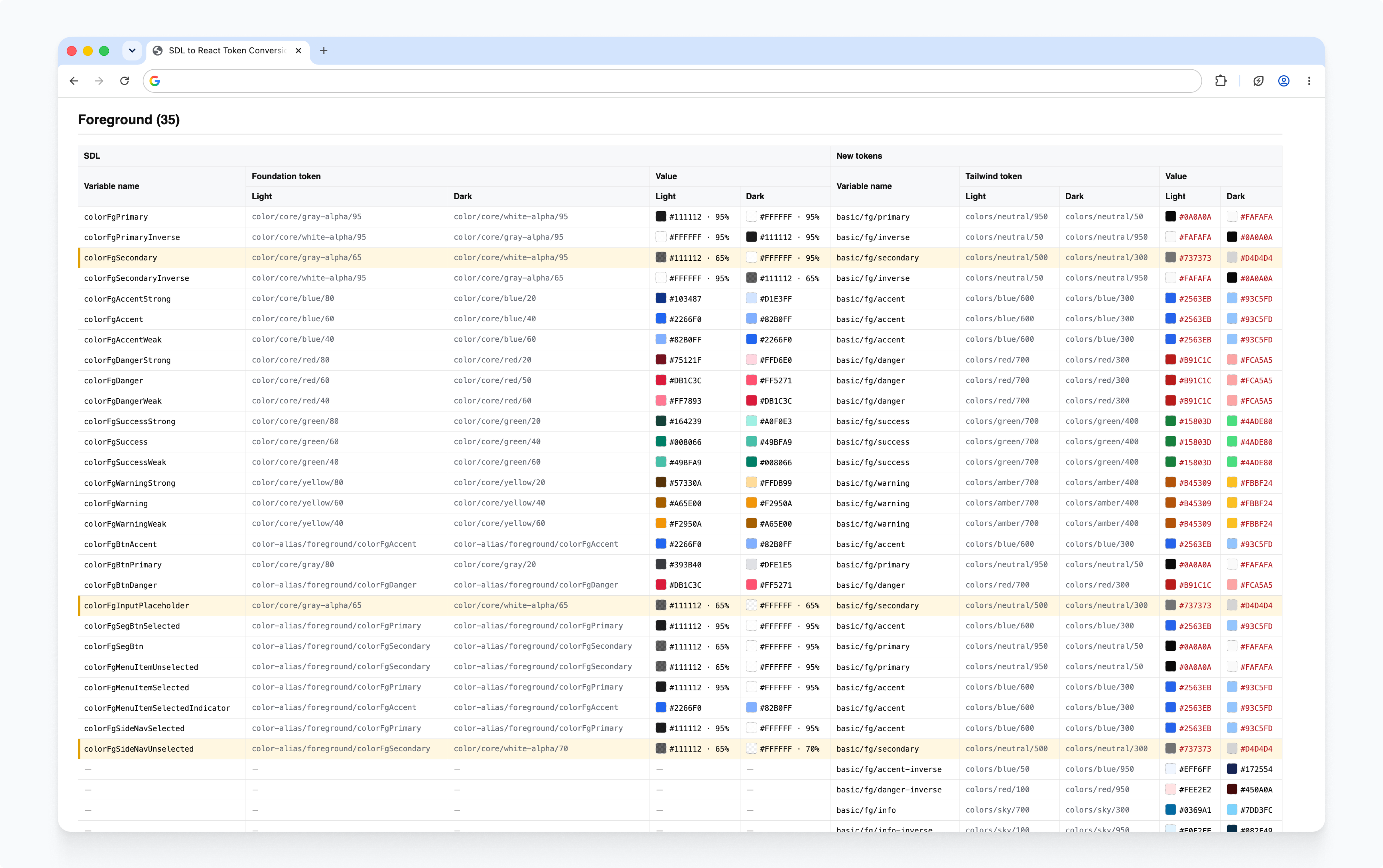
C3 has many products built by different teams, and over time their interfaces drifted apart, with inconsistent colors, spacing, and components, plus a lot of deprecated styles. As teams moved their apps onto React and shadCN, there was a chance to fix this at the foundation.
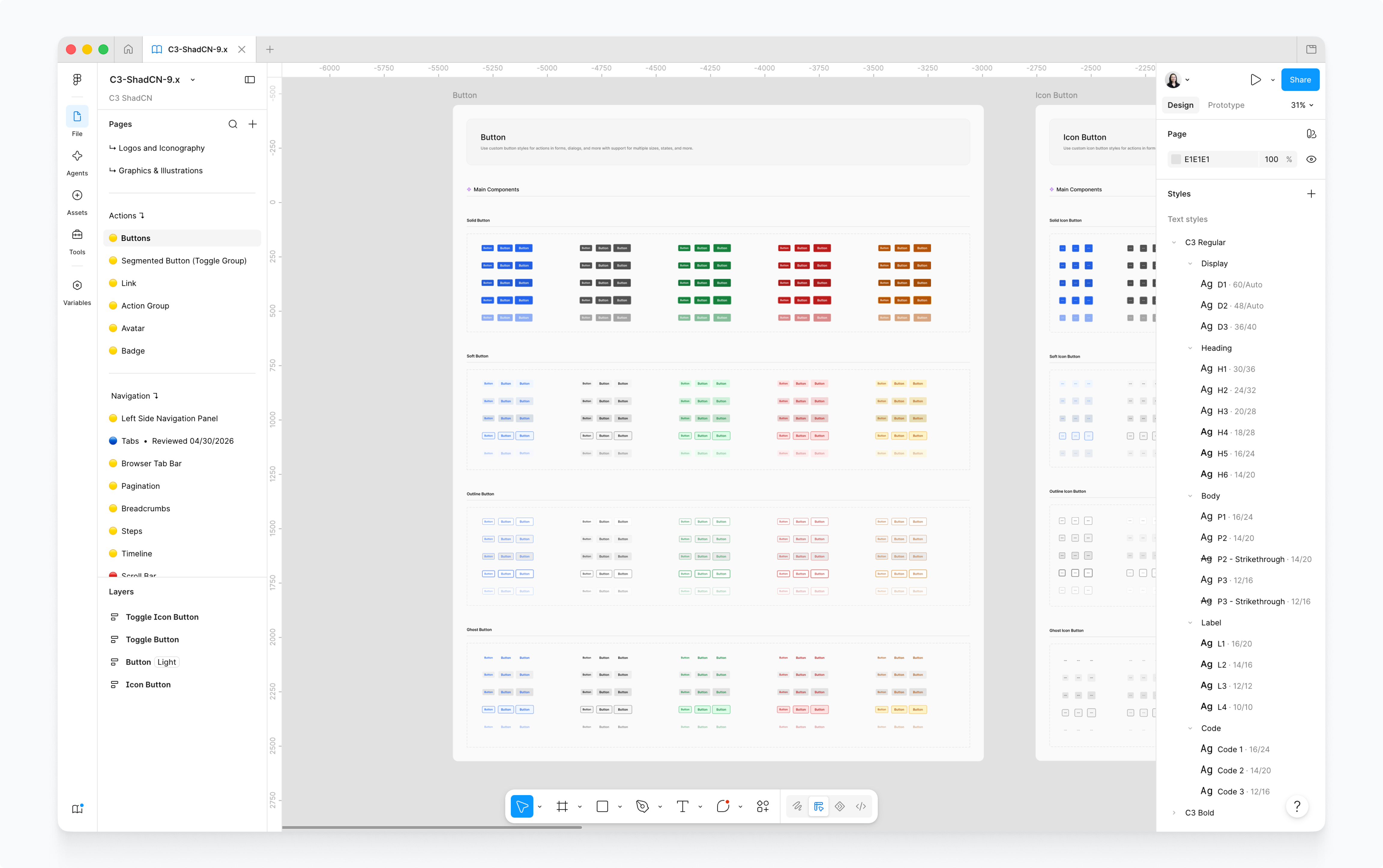
Approach
Biggest change in the design workflow after the introduction of AI tools was the increased accessibility to higher fidelity prototypes with complex microinteractions and real mock data.
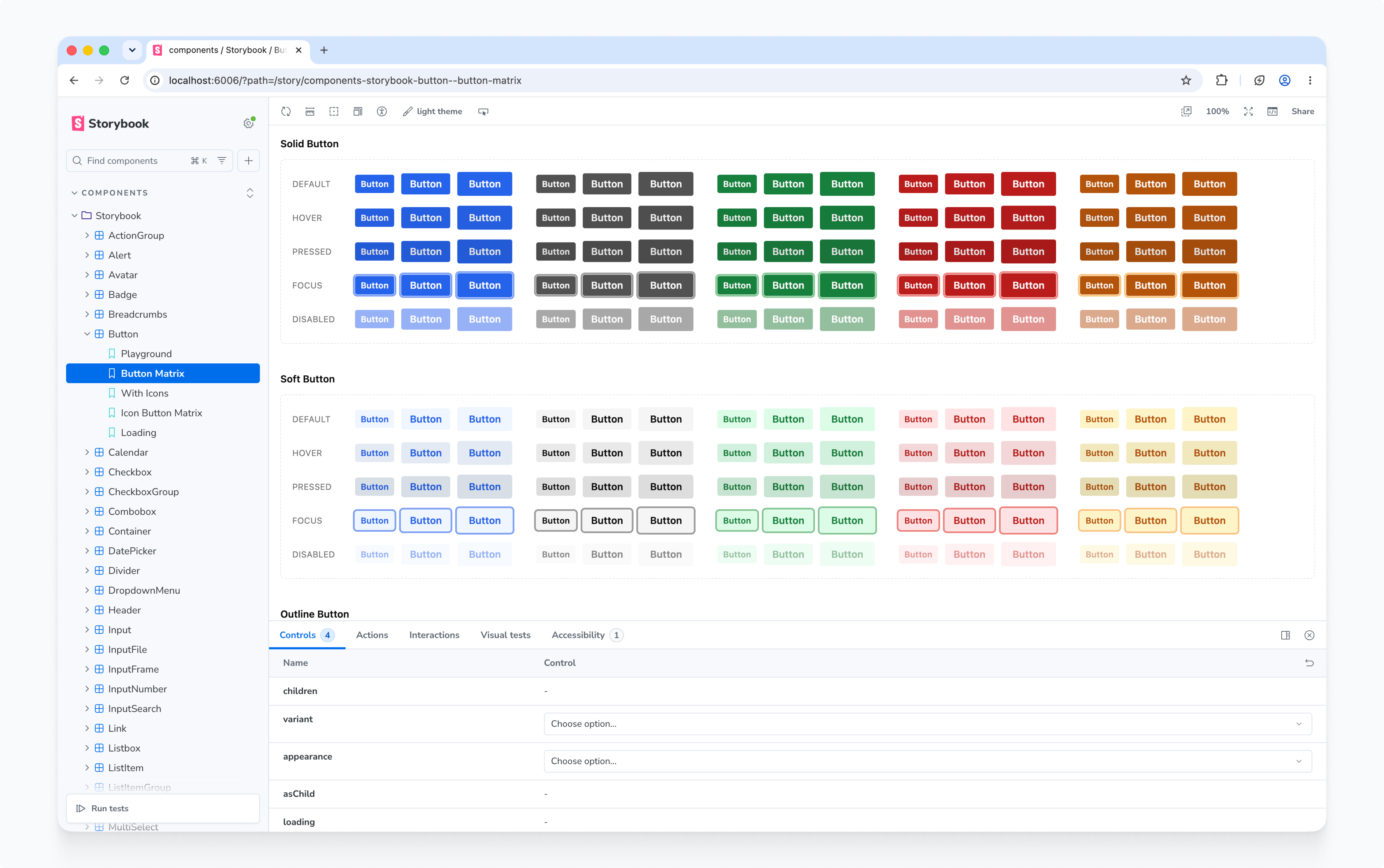
The problem was that every new feature designed meant hours of additional tweaking. “This button should have a min-width of 64px.” “This is fg-primary.” A component library was needed to improve the speed of this pipeline.
Impact
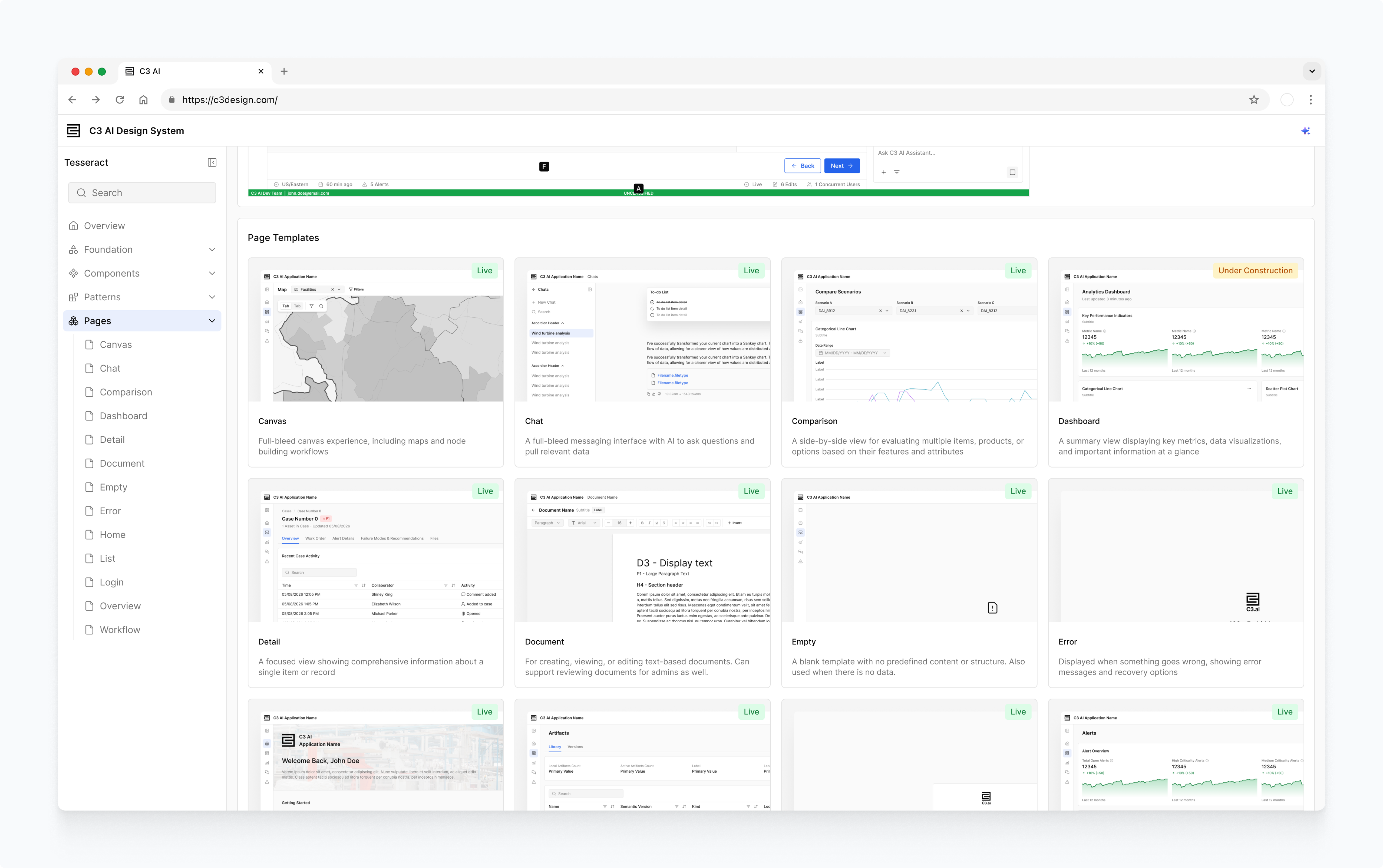
Published component library package is available to everyone on the design team to use for prototyping, and all Reliability engineers have access to the components as well. On average, the team was able to shave off 2 to 3 days worth of busy work by having a component library to reference.